AeroSlice
Branding | Editorial
AeroSlice is a modern pizza delivery service that utilizes drone technology. My goal was to design a brand identity and system that communicates speed, innovation, and reliability. I focused on creating an identity that feels modern and energetic while still emphasizing quality and freshness. I kept a cohesive visual language that supports a smooth experience and reflects the brand’s forward-thinking approach.
Process


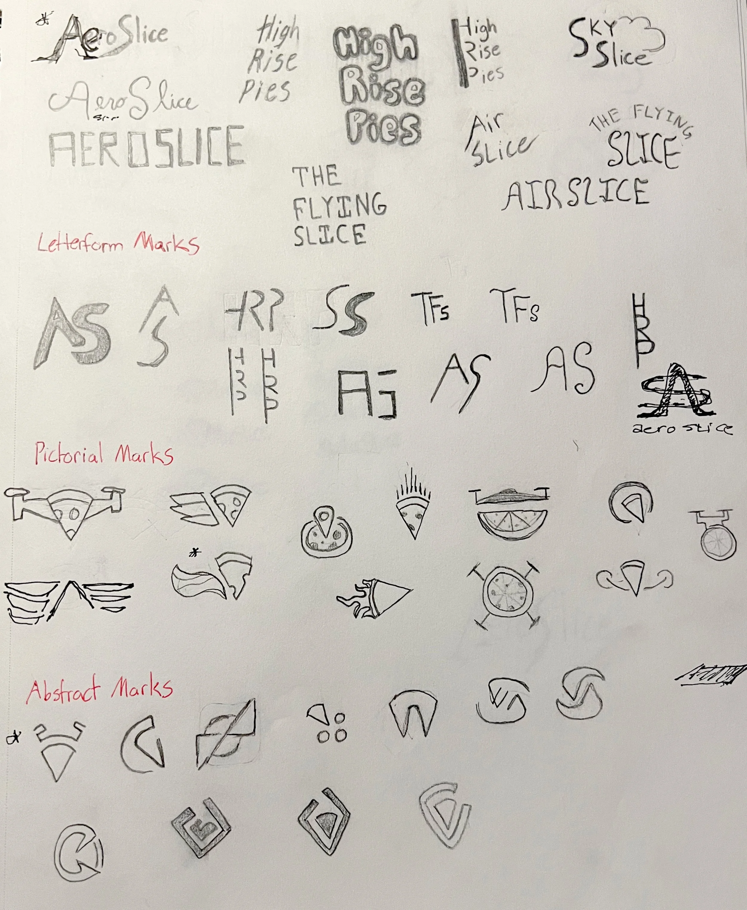
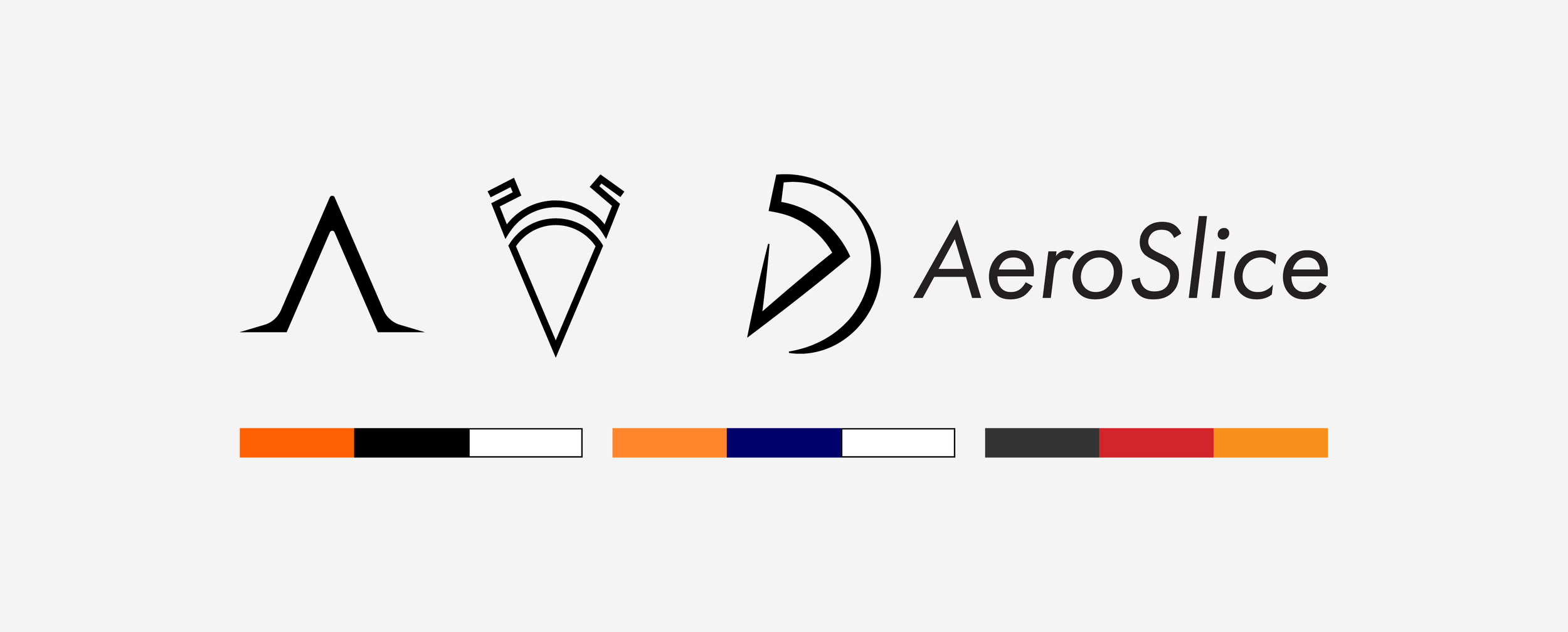
I started this project by exploring names and sketching logos for the brand. After landing on AeroSlice, I narrowed down the logos, explored color palettes, and began defining the overall direction of the identity. I ultimately decided on three key words that would shape the brand: Energetic, Efficient, and Modern.
Brand Touchpoints
After establishing a clear direction for the brand, I designed several brand system components that work cohesively and have a recognizable visual language across print and digital platforms.
Brand Standards Manual
While creating the different touchpoints for the brand, I developed a brand standards manual that covers the brand elements and how to properly integrate them.